
Master Flexbox with CSS: 10 tricks to Modern Web Design
Flexbox is a CSS layout model that simplifies the arrangement and alignment of elements within a container.
It has become popular due to its efficiency in creating responsive and complex web layouts. Some projects in which Effectus Engineers’ Team have used it are:
Flexbox took part in


Do you want to collaborate? Contact us or just fill our Pre-Sale tool.
A quick glimpse into Flexbox
A short for “Flexible Box Layout,” is a CSS layout model designed to simplify the use of elements within a container. Here are some key points about Flexbox:
- Container and Items: Two main components, the flex container and the flex items. The container is the parent element that holds the items you want to lay out in a flexible manner.
- Direction: You can define the direction in which items are arranged within the container. Default: horizontal arrangement, but you can switch to vertical by setting the
flex-directionproperty. - Alignment: Flexbox offers powerful alignment options. The alignment of items along the main axis (the direction you define) and the cross-axis (the perpendicular direction).
- Distribution: Flexbox allows you to distribute space within the container, making it particularly useful for creating responsive layouts. Control extra space or insufficient space distribution.
- Flex Properties: Flex items can have properties like
flex-grow,flex-shrink, andflex-basisto determine how they size themselves within the container. - Justify Content: This property lets you control the alignment of items along the main axis, helping with horizontal alignment.
- Align Items and Align Self: These help you align items along the cross-axis, both at the container level (
align-items) and on an individual item basis (align-self). - Ordering: You can rearrange the order of items within the container without changing their position in the source code using the
orderproperty. - Nesting: You can nest flex containers within each other to create complex layouts.
- Browser Support: Flexbox is well-supported in modern web browsers, making it a practical and reliable tool for web design.
So, which property or tool do you believe has helped you the most? We’re sure that you’ve dive into Flexbox more than once!
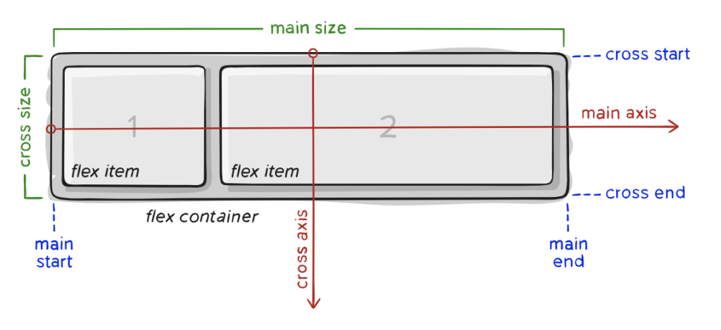
Learn the jargon
Items will be laid out following either the main axis or the cross axis.
- main axis – The main axis of a flex container is the primary axis along which flex items are laid out.
- main-start | main-end – The flex items start from main-start and going to main-end.
- main size – A flex item’s width or height.
- cross axis – The axis perpendicular to the main axis is called the cross axis. It depends on the main axis.
- cross-start | cross-end – Flex lines are filled with items and placed into the container starting on the cross-start side of the flex container and going toward the cross-end side.
- cross size – The width or height of a flex item, whichever is in the cross dimension, is the item’s cross size.
Why?
Using Flexbox jargon, which includes terminology like “flex containers,” “flex items,” “main axis,” “cross axis,” and CSS properties like flex-direction, justify-content, and align-items, is important for several reasons:
Clarity and Communication
Flexbox jargon provides a common language for web developers and designers to communicate effectively. When you use these terms, you’re more likely to be understood clearly by others in your field.
Documentation and Learning
Flexbox jargon is widely used in documentation, tutorials, and resources related to web development. When you understand and use these terms, it’s easier to learn from and contribute to these resources.
Consistency
Using the correct terminology helps maintain consistency in code and design discussions. It prevents misunderstandings and ensures that everyone involved in a project is on the same page.
Efficiency
Flexbox jargon provides a concise way to describe layout concepts and properties. It’s more efficient to say “flex container” than to describe the container as “the parent element with its display property set to flex or inline-flex.”
Troubleshooting
When issues arise in your layouts, knowing the jargon can help you diagnose and resolve problems more quickly. You can pinpoint which aspect of the layout is causing the issue, making debugging easier.
Professionalism
Using the correct terminology demonstrates professionalism and expertise in web development. It shows that you have a solid understanding of the technology and can collaborate effectively with others in the field.
Let’s get hands on
Here we’ll bring some examples of our own. Out top-devs Juan Pablo Martinez and Juan Sebastián Aguirre share their knowledge:
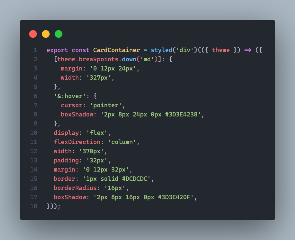
Find an example of a flex-direction column. Here you’ll find the code without styles, sheer CSS:
.CardContainer {
  display: flex;
  flex-direction: column;
}
So, you’ll organize your card like this:

And here you can find some code sample with styled-components library in it to get some inspo:
In this case it’s an image separated from the text. The text container behaves as a column so it divides them in the y axis:

Here’s when magic happens, what if I want to go mobile?
What happens is that it takes the row [where the image is] and it makes it a column. So, the image is placed on top and the text container at the bottom.

Find the code sample here to make your card responsive:
.Card {
  display: flex;
}

@media (max-width: 768px) {
  .Card {
    flex-direction: column;
  }
}
If there’s something we can say, it’s that we’ve found in Flexbox a top-notch tool to use, full of strategies, properties and ready-to-use hacks.
As one of our pillars, continuous improvement is of paramount importance. So, we are adamant about the fact of practicing, practicing, practicing!
What technologies and languages work well with Flexbox?
Flexbox can be used in conjunction with various web technologies and programming languages to create flexible and responsive web layouts. Here are some of the technologies and languages that work well with Flexbox:
- HTML: Flexbox works with HTML to structure and organize the content of a web page. You define the elements you want to arrange using Flexbox in your HTML document.
- CSS: Flexbox is a CSS layout model, so it naturally pairs with CSS for styling and positioning elements. You use CSS properties like
display,flex-direction,justify-content, andalign-itemsto control the behavior of flex containers and items. - CSS Grid: CSS Grid is another CSS layout model that complements Flexbox. While Flexbox is best suited for one-dimensional layouts (e.g., rows or columns), CSS Grid is designed for two-dimensional grid layouts. They can be used together to create complex and versatile designs.
- JavaScript: JavaScript can be used to manipulate and update the behavior of Flexbox layouts dynamically. For example, you can use JavaScript to add or remove flex items, change their order, or adjust their sizes based on user interactions or data from a backend.
- Responsive Design Frameworks: Popular front-end frameworks like Bootstrap, Foundation, and Bulma can be used with Flexbox to create responsive and mobile-friendly web designs. These frameworks often include Flexbox-based grid systems.
- SASS/SCSS: Preprocessors like SASS (Syntactically Awesome Style Sheets) and SCSS (Sassy CSS) can be used to write more organized and maintainable CSS code, including styles for Flexbox layouts.
- Backend Technologies: While not directly related to Flexbox, backend technologies (e.g., Node.js, Python, Ruby on Rails) are essential for serving dynamic data to your web application. The backend can provide the content that is structured and presented using Flexbox on the frontend.
- Web Development Libraries: JavaScript libraries and frameworks like React, Angular, and Vue.js are commonly used in conjunction with Flexbox for building dynamic and interactive user interfaces.
- CSS-in-JS: Some web development setups use CSS-in-JS solutions like styled-components (for React) to create and manage styles with JavaScript. These can be used in combination with Flexbox.
In summary, Flexbox is a versatile tool for web layout, and it can be integrated seamlessly with a wide range of web development technologies, languages, and tools to create responsive and flexible web designs.
Visual learner?
Is there any room for a backend savvy?
Here’s how Flexbox and the backend can work together:
Data Presentation: The backend of a web application is responsible for data processing, retrieval, and management.
Once the backend retrieves and processes data, it often sends it to the frontend for presentation. Flexbox is used in the frontend to control how this data is displayed to users.
Imagine you’re building an e-commerce website that displays a list of products retrieved from a backend database.
The backend is responsible for managing the product data, while the frontend uses Flexbox for layout and presentation.
- Backend (Server-side):
- The backend server stores product information in a database, including details like product names, descriptions, prices, and images.
- When a user visits the website, the backend server receives a request for the product data.
- The backend retrieves the product data from the database and sends it to the frontend in a structured format, often as JSON data.
- Frontend (Client-side):
- The frontend, built with HTML, CSS, and JavaScript, receives the product data from the backend.
- Flexbox is used to create a flexible and responsive product listing layout. For example, each product can be represented as a flex item within a flex container.
from flask import Flask, jsonify

app = Flask(__name__)

# Sample product data (can be replaced with data from a real database)
products = [
    {
        'id': 1,
        'name': 'Product 1',
        'description': 'Description of Product 1',
        'price': 19.99,
        'image_url': 'product1.jpg'
    },
    {
        'id': 2,
        'name': 'Product 2',
        'description': 'Description of Product 2',
        'price': 29.99,
        'image_url': 'product2.jpg'
    },
    # Add more product items as needed
]

@app.route('/products', methods=['GET'])
def get_products():
    # Simulating fetching data from a database
    # In a real application, you would query a database for the product data
    return jsonify(products)

if __name__ == '__main__':
    app.run(debug=True)
<div class="product-list">
<div class="product">
<img src="product1.jpg" alt="Product 1">
<h2>Product 1</h2>
<p>Description of Product 1</p>
<span>$19.99</span>
</div>
<!-- More product items go here -->
</div>.product-list {
display: flex;
flex-wrap: wrap;
justify-content: space-between;
}
.product {
flex: 1 0 calc(33.33% - 10px);
margin: 10px;
}- JavaScript may be used to dynamically populate these product items with the data received from the backend. Each product’s name, description, price, and image are displayed within their respective flex items.
- User Interaction:
- Users can interact with the frontend to view product details, add items to a shopping cart, or proceed with the purchase.
All in all, Flexbox is used to create a responsive grid of product listings, making it visually appealing and adjusting the layout based on the available screen space.
The backend manages the product data and provides it to the frontend, which, in turn, uses Flexbox for flexible and user-friendly data presentation.
Let’s round up!
Stay tuned, and don’t forget to check out our other posts for more insights on code improvement and tips!
Whether you’re a seasoned developer or just starting out, Flexbox is definitely worth considering for your next mobile app project. Check our posts and Instagram to find out more!
Leave a Reply
You must be logged in to post a comment.